How to Take Your Own Passport Photo
Courtesy, Caroline Morse Teel, SmarterTravel

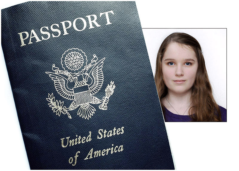
After paying $15 to have an awkward photoshoot in the aisle of a CVS, only to have my passport photos rejected twice (once for being too dark and once for being too bright), I decided there had to be a better way to take your own passport photo. Turns out, snapping your own passport photo is easier, cheaper, and much more convenient than going to a “professional” (a.k.a., the cashier at your local drugstore). Here’s a few tips:
Websites to Help You Take Your Own Passport Photo
- The State Department: Bureaucracy has moved into the 21st century, and even the State Department wants to help you take your own passport photo by offering this free photo cropping tool that will size your photo correctly so that you can print it yourself.
- MyPassportPhotos.com: If you don’t want to deal with printing your own photos, or if you need a passport/visa photo for another country (which may be a different size than the U.S. passport photo), MyPassportPhotos.com does everything for you, including printing and mailing your images directly to your house. You can also pay extra to have your photos checked to make sure that they will be approved.
- Passport Photo Booth: This app helps you with the photo composition needed for passport photos, showing you exactly where to pose within the frame. You can e-mail or save the image for free, or pay extra to have it printed.
Key Passport Photo Requirements
Make sure your passport photo meets all of the State Department’s requirements. Here are key requirements listed on the website:
- Color photos only
- “Sized such that the head is between 1 inch and 1 3/8 inches (22 mm and 35 mm), or 50 percent and 69 percent of the image’s total height from the bottom of the chin to the top of the head. (Click here for a photo composition template to use as a guideline.)”
- “Taken within the last 6 months to reflect your current appearance”
- “Taken in front of a plain white or off-white background”
- “Taken in full-face view directly facing the camera”
- “Neutral facial expression and both eyes open”
- “Taken in clothing that you normally wear on a daily basis”
- “Uniforms should not be worn in your photo, except religious clothing that is worn daily.”
- “Do not wear a hat or head covering that obscures the hair or hairline, unless worn daily for a religious purpose. Your full face must be visible, and the head covering must not cast any shadows on your face.”
- “Headphones, wireless hands-free devices, or similar items are not acceptable in your photo.”
- “No eyeglasses allowed”
The State Department has some good photo examples of images that are and are not accepted. Check them out here.
How to Take Your Own Passport Photo
- Get a neutral background: If you don’t have any plain white walls to pose in front of, you can tape a piece of plain white poster board behind you to create a clean backdrop.
- Check the lighting: You can’t have any shadows in your passport photo, so taking it in natural daylight on a sunny day works best.
- Get help: A selfie won’t be accepted, so you’ll either need to use a tripod or ask a friend to snap your picture.
Caroline Morse Teel has more travel tips than how to take your own passport photos. Follow her on Instagram @TravelWithCaroline for advice and inspiration.
19 Tips for Better Travel Photos
Courtesy, Ed Hewitt SmarterTravel

There are plenty of resources out there for folks with thousands of dollars of photographic equipment, but what about the rest of us — those of us with a point-and-shoot digital camera or even simply a smartphone? What can we do to get better travel photos? Following is a collection of low- and no-tech tips to help you improve your keeper count on your next trip.
1. Think “people, places, things.”
This old definition of the use of a noun is a handy guide to a great vacation photo: the best travel photos will often be about all three of these. To illustrate, let’s say you want to take a photo of the Tower of London on a rainy day. If you pull up your photo and snap the Tower in the gray light, you could get a decent photo. But if you put your kids in the photo (your favorite people) with the Tower glimpsed over their shoulders (the place of interest), visible just under the rim of an umbrella (a very specific thing that evokes the conditions), you have a great shot.
2. Get closer.
As Robert Capa famously said, “If your pictures aren’t good enough, you’re not close enough.” Taken literally, the closer you get to your subject, the more detail and interest you can capture.
There are a couple of ways to do this, both equally valid and effective. One is to use the telephoto features found on most cameras to zoom in on your subject. Before anyone cries cop-out, this can be a very effective photographic technique, and has resulted in countless compelling images in this age of big lenses.
The other is simply to walk closer to your subject. Not everyone is comfortable doing this, but the person viewing the photo will appreciate it; despite how close a zoom lens makes things appear, when viewing a photo the human eye can still sense the distance, and appreciates when an image has truly been taken up close.
3. Be in the thick of it.
A less literal read of Capa’s statement, and probably the one closer to his intent, suggests that Capa likes photos in which the photographer him- or herself seems to be part of what is going on, and not standing apart from the action. Capa’s solution to get more intimate, engaged photos is simply to be more intimately involved in the photo yourself.
4. Think about the light, not the view.
The human eye is vastly more adaptable and clever than the lens of your camera, and what you see when you are standing in front of your intended subject may not be what your camera ultimately reproduces. When staring directly into the sun, you may be able to make out colors and people, but your camera is going to reproduce mostly shadows. Or when shooting into shadows, you may be able to see features, but your camera will reproduce a lot of dark stuff. In these cases, it helps to …
5. Know where the sun is.
The easiest way to flatter your subject is to put it in the best light. If you want your subjects’ faces to shine, turn them so the sun is shining on their faces. If you want your photo of your cruise ship to look like the brochures, take the photo on the sunny side of the ship. Alternately, if you want to catch the glistening of light on the ocean, take the photo when the sun is low enough to bounce off the waves.
6. Consider the time of day.
This is a fairly simple story — there’s no time like sunrise or sunset to take compelling, interesting and even stunning travel photos. Sunrise in particular can produce very striking images, in part because most people are not awake at the crack of dawn, and so can still be surprised by a sunrise photo.
7. Turn the camera on its side.
In some situations, turning the camera on its side to take a vertical shot is just not good composition, it is almost essential — when taking a photo of Auckland’s Sky Tower, for example. But taking vertical shots also has an added benefit: it will enhance the interest of your overall photo collection considerably, adding geometrical variety as folks flip through your vacation slideshow.
8. Fill the frame.
When giving instructions to new photographer hires, I always tell them that the interesting parts of the scene should start at the left edge of the viewfinder and end at the right edge. That is, the subject should absolutely fill the frame such that the edges of the photo will include as little superfluous imagery and information as possible.
I find this tactic offers a couple of distinct advantages. First, the intended subject of your photo is absolutely clear to anyone who sees the photo. And second, the photo becomes a thing apart from how we usually see the world, which is more or less in 180-degree panorama thanks to our peripheral vision. A photograph can isolate and amplify our experience, which turns out to be one of the attractions of travel itself, as well.
Related: 12 Things You Don’t Photograph — But Should
9. Divide the scene into threes.
If you put something right in the middle of the frame, the photo is about that thing. Another great tactic for creating visual interest in a somewhat routine shot is to frame the shot such that your subject is not in the dead middle of the photo, but is placed off-center in the frame. An easy way to think about this is mentally to divide the frame into three sections (left, center and right), and put the main subject of the photo either entirely within the left or right section, or perhaps right on the line dividing two sections.
How to choose on which side to put the subject? This is easy — put it on the side that has the least background interest in the overall frame. This way, the viewer can be tricked into thinking you took a photo of both the subject and the background activities, with equal emphasis on both.
When combined with the tactic of taking a vertical shot, this can be very powerful — a vertical shot with the subject 1/3 of the way from either edge is one of the easiest ways to compose a compelling photo with minimal effort.
You can also divide the photo vertically into threes as well so that you have a grid of nine squares total to work with. This tactic has a name, long called the Rule of Thirds.
10. When taking a photo of a person, emphasize the person.
When taking photos of traveling companions, it is easy to prop them up in front of something interesting and then take the picture. If you go to some effort to get the attraction behind them, but cut off the top of someone’s head, or include a sloppy untucked shirt, or cut the photo off at someone’s socks, you have a good photo of the sight and a terrible photo of your friends. In this case, frame them first and then worry about the background.
11. Move.
I find that very often a decent photo could have been a great photo if I had just moved a little bit, whether to reframe the photo slightly, or to put something interesting into the background. This can involve moving a few steps forward or back, shifting to one side or the other, or crouching down. As a photographer, you have much more control over what you are doing and where you are standing than you do over the subject matter; if you just stand lead-footed in one spot, your photos will reflect this.
12. Zoom in and out until you like what you see.
If your camera has a zoom feature, and most do these days, you can help yourself to “move” by zooming in and out on your subject. I find that when you do this, at the point the scene becomes most interesting, your eye will notice it — that is, you’ll just like it more intuitively. That’s when you take the shot.
13. Pay the most attention to the edges and corners.
A great photo is as often defined by what is left in as by what is left out. You have considerable control here, and while it is normal human behavior to look directly and in a concentrated way at the things that interest us most, the camera behaves otherwise.
Very often you can take a photo that seems like it might turn out extremely well, but when you see the print of a photo, your friend is a speck in the middle of a nondescript background. Take all that stuff out, and you have a great photo.
In the same way, if you zoom in very closely on someone’s face, and cut out the monkey standing on her head, you missed the shot.
When zooming in and out, or moving around while looking through the viewfinder or at the screen to frame your photo, the first thing to scan is the sides and corners of the visible area. Is there anything of interest there? If not, consider moving again, changing the zoom, or tilting the camera up, down or to one side. When everything seems to fall into place, fire away.
Related: A Pro Photographer Shares Her Secrets
14. At familiar sites, emphasize something other than the subject.
If you are photographing the Eiffel Tower, Big Ben, Mount Rushmore or any other frequently photographed site, you would often do better to buy a nice calendar than take yet another point-and-shoot photo that will just take up space on your hard drive until it crashes.
But if you make it a photo about something else — your companion’s goofy hat with the Eiffel Tower in the background, or a bobby in front of the Houses of Parliament, or a motorcycle gang parked in front of Mount Rushmore — then you have a great photo.
15. Take control.
When I take photos of people, almost invariably they try to set up the shot themselves, arranging themselves and companions in a way that they think might make a good picture. And as often as not, they arrange themselves such that I would be shooting straight into the sun, or with half of the group in shadows, or with one person almost completely obscured by another person. None of these will make for good photos. You’re the one with the camera — you set up the shot.
16. Look, then think, before you shoot.
Before taking a photo, if you just take a quick look at your surroundings, and give yourself a second to think about anything interesting that might be happening, you will get a much higher percentage of interesting photos than if you simply pull your camera to your eye and snap without planning what you want to capture.
17. Try to take photos where you didn’t “have to be there.”
If you want to take a great photo and not merely a snapshot of your traveling companions in a certain location, think about how a complete stranger would react to seeing your picture. Photos that are thereby intrinsically interesting will enhance and retain their interest to you as well.
18. Use your sense of humor.
Do not underestimate the value of capturing or expressing a little humor when taking travel photos. Travel is usually as much about how we felt and thought while traveling, not just where we went, and photos that capture some humor often bring back the strongest memories and sensations as time goes by.
19. Use a good printing company (or printer if you print your own).
Ansel Adams compared photography to a piece of music, stating that “The negative is comparable to the composer’s score and the print to its performance.” Clearly most folks no longer deal with film negatives, but if we let the digital file replace the negative, Adams’s truism still stands up. If you take a great photo but the print is washed out, grainy or otherwise sub-par, it doesn’t matter if the composition is great — the performance was not.


